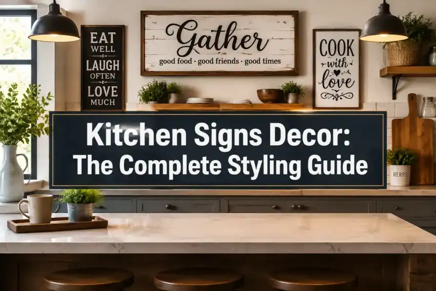
Quick Answer
Kitchen signs decor works best when you treat one sign as the main event, not as wallpaper. Choose a sign that spans roughly 60-75% of the wall or furniture piece below it, keep the wording short and specific to how you actually use the space (Pantry, Coffee, Daily Bread), and match the material to your cabinet finishes. Expect to spend somewhere in the range of $15, $40 for a small mass-market sign and $45, $150 for a large personalized wood sign, based on typical marketplace listings. One well-scaled sign, layered with a plant or basket, always looks more intentional than five tiny ones.
Table of Contents
Key Takeaways
- Scale is the number one fix. Most kitchen signs look cheap because they’re too small for the wall, not because they’re signs.
- One word beats a paragraph. Short, functional wording (Pantry, Bakery, Coffee) reads as considered; long quotes read as dated.
- Wood adds cozy textures and warmth; metal adds crisp contrast and suits modern, industrial, and vintage kitchens.
- Layer, don’t line up. Pair a sign with shelves, a basket, greenery, or plates so it feels styled rather than stuck on.
- Renters have great options: removable adhesive strips, leaning signs on shelves, picture ledges, and over-the-door hooks.
- Personalized wood signs (family name, established date, custom pantry lettering) command the highest prices and feel the least generic.
- Cap the count. In a standard kitchen, one to two word-based pieces is the sweet spot for clutter-free styling.
- Signs aren’t outdated, but the old farmhouse script look is. Cleaner fonts, muted paint colors, and larger formats are what feel current.
What Are Kitchen Signs Decor Used For?
Kitchen signs decor serves three jobs: filling awkward blank wall space, labeling a zone so it feels purposeful, and adding personality to a room dominated by hard surfaces. A kitchen is mostly cabinetry, tile, and appliances, so a single wood or metal sign brings in warmth and a human voice without taking up counter space.
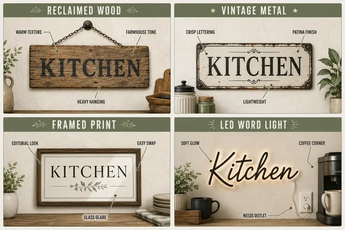
The most useful placements are the ones that mark a function:
- Above open shelving to visually cap a busy shelf and stop it floating.
- Over a coffee station to turn a random corner into a defined little bar.
- On or beside a pantry door to label storage and add architectural interest.
- Above a breakfast nook or banquette, where a horizontal sign mimics the bench line.
- On a narrow wall between windows or cabinets where framed art would feel cramped.
The steady stream of listings on Etsy’s kitchen signs marketplace shows how broad the category runs, from tiny shelf-sitters to oversized statement boards. That range is exactly why scale matters more than style.
Decision rule: if the wall already has hardworking visual interest (patterned tile, glass cabinets, a range hood), skip the sign there and put it on a quieter wall instead.
Kitchen Signs Decor: Wood vs Metal, Which Is Better?
Wood is better for warmth, farmhouse and cottage style, and personalization. Metal is better for crisp lettering, vintage or industrial character, and rooms that need contrast rather than more texture. Neither is universally superior, so match the material to what your kitchen is missing.
| Material | Best for | Look and feel | Watch out for |
|---|---|---|---|
| Reclaimed or painted wood | Farmhouse, cottage, French country | Cozy textures, soft edges, custom lettering | Heavy; needs a proper anchor |
| Vintage metal or enamel | Industrial, retro, modern | Sharp type, patina, lightweight | Can read cold in an all-white kitchen |
| Framed print or canvas | Modern minimalist living | Editorial, gallery-like, easy to swap | Glass glare near windows |
| Acrylic or laser-cut | Contemporary, small spaces | Clean lines, almost weightless | Shows dust and fingerprints |
| LED or neon word light | Coffee bars, bar carts, playful corners | Glow, evening ambience | Needs an outlet; keep it to one |
Quick rule: repeat a finish you already own. Brass hardware pairs beautifully with an aged metal sign. Walnut floating shelves pair with a stained wood sign. That single repetition is what makes a sign look built-in.
Edge case: near a range or sink, avoid untreated raw wood and paper-backed prints. Grease and steam warp them. A sealed wood or powder-coated metal sign holds up far better.
Kitchen Signs Decor: Rustic vs Modern Styles (and Farmhouse Done Well)
Rustic signs use distressed wood, chunky frames, and warm neutrals; modern signs use thin frames, clean sans-serif type, and high contrast. Both are current. What’s fallen out of favor is the mass-produced script quote in a thin white frame, repeated four times across one wall.
For farmhouse and country kitchens:
- Pick one large horizontal board in a soft, chalky color: bone, putty, sage, or faded black.
- Prefer functional words (Pantry, Market, Fresh Eggs, Daily Bread) over sentimental sentences.
- Balance it with real texture: a woven basket, stoneware crock, linen towel, or dried stems.
- Let the wood tone repeat elsewhere in the room, like a cutting board or stool.
The volume of listings under country kitchen decor signs tells you the farmhouse look is far from dead, but the polished version leans quieter now.
For modern and minimalist kitchens:
- One black-and-white typographic print in a slim oak or black frame.
- Single-word metal lettering, unframed, mounted directly to the wall.
- Muted palette only, so the sign reads as art rather than signage.
Choose rustic if your kitchen has wood tones, shaker doors, or open shelving. Choose modern if you have flat-front cabinets, stone or quartz surfaces, and calming neutral tones. For more full-wall composition ideas, our kitchen wall decor ideas guide walks through layouts beyond signs alone. Retro fans will also find plenty of crossover in vintage retro kitchen decor.
Are Kitchen Signs Decor Tacky or Outdated?
Kitchen signs aren’t tacky. Quantity, tiny scale, and generic sentimental wording are what read as tacky. A single oversized sign with restrained lettering looks as intentional as any framed art print.
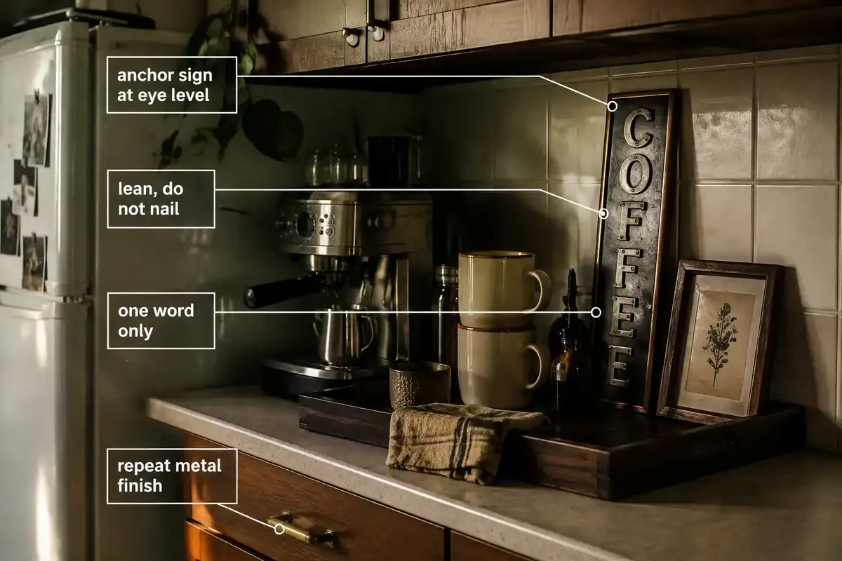
Three habits separate polished from dated:
- Wording. Specific and functional wins. “Coffee” beside a coffee maker feels deliberate. A long inspirational quote above the sink feels like it came from a clearance bin.
- Scale. Small signs floating on big walls are the fastest way to make a room look unfinished.
- Repetition. Multiple word signs compete with each other. One voice, not a chorus.
A sign should sound like your household, not like a gift shop. If the phrase could hang in anyone’s kitchen, keep looking.
The broader shift is toward larger, quieter statement pieces, which is visible in the demand for oversized kitchen sign formats and in the general direction of trending home decor listings. Fewer pieces, bigger impact.
Best Kitchen Signs Decor Ideas for Small Spaces
In small kitchens, go vertical, go single, and go where the wall is already dead space. One narrow sign in an underused spot adds character without eating into your working surfaces.
- Coffee corner: a slim vertical sign leaned against the backsplash behind a tray, or mounted on the side of an upper cabinet.
- Pantry cupboard: hang a small sign directly on the cabinet door instead of the wall.
- Above the doorway: a long, shallow sign over a door frame uses space nothing else can.
- Between window and cabinet: a tall, skinny sign fits where a frame won’t.
- On a picture ledge: lean a sign behind mugs and a tiny plant for a layered, zero-hole look.
- Inside a breakfast nook: one horizontal board centered above the bench, roughly two-thirds the bench width.
Common mistake in small kitchens: hanging the sign too high. Center it at eye level or about 6-8 inches above the shelf, counter, or bench it relates to, so it feels connected rather than stranded. Our kitchen shelf styling ideas cover how to keep that shelf-plus-sign combination from tipping into visual noise.
How Much Do Kitchen Signs Cost, and Where Can You Buy Them Online?
Typical pricing, based on current retail and marketplace listings, breaks down roughly like this: small printed or metal signs run about $15,$40, mid-size wood signs about $30,$70, and large or personalized custom wood signs about $45, $150 or more. These are estimates, not fixed prices, and size plus customization drive most of the difference.
Where to look, and what each source is good for:
- Etsy for handmade, personalized, and custom-lettered wood signs. Independent shops handle custom names, dates, and sizing, and the broader Etsy home decor bestseller landscape shows personalized wall pieces consistently among the strongest performers.
- Amazon for budget metal sets, small themed signs, and fast shipping.
- Home decor chains (Target, Hobby Lobby, HomeGoods, At Home) for large formats you can see in person, which helps with scale.
- Antique shops, flea markets, and estate sales for genuine vintage enamel and tin signs with real patina.
- Print-on-demand art shops for typographic prints if you want the sign look in a frame.
Buying tip: always check listed dimensions, not photos. Staged product photos routinely make a 12-inch sign look like a 30-inch one. Measure your wall with painter’s tape first. Trend-focused categories like Etsy’s kitchen trend listings are useful for spotting current colors and fonts before you commit.
DIY Kitchen Signs Decor: How to Make One
A DIY kitchen sign takes an afternoon and usually costs $10, $25 in materials. The most reliable method is a sanded pine board, a stained or painted base, vinyl stencil lettering, and a matte sealer.
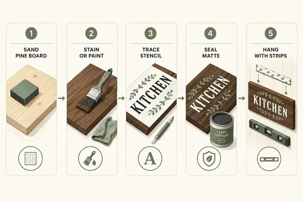
- Cut and sand. Use a pine or poplar board, or a thrifted cutting board or cabinet door. Sand edges smooth.
- Base coat. Stain for a warm rustic tone, or use chalk paint in a muted neutral. Two thin coats beat one thick one.
- Letter it. Cut vinyl letters with a craft machine, use adhesive stencils, or hand-trace a printed font with transfer paper. Press stencil edges down hard to stop bleed.
- Paint the letters. Dab, don’t brush, so paint doesn’t creep under the stencil. Peel while slightly tacky.
- Distress and seal. Light sanding along the letters and edges softens it. Finish with matte polyurethane or wax so grease wipes off.
- Hang. D-rings and a wall anchor for heavy boards, removable strips for lightweight ones.
Best DIY fonts: simple serif or condensed sans-serif. Skip thin brush scripts, which are what make homemade signs read homemade.
Personalized Kitchen Signs Decor Options
Personalized signs are the least generic option and the reason custom wood pieces sit at the top of the price range. The wording matters more than the design: a real name, place, or date instantly separates your sign from mass-market stock.
Ideas worth considering:
- Family name plus established year on a horizontal board above a nook.
- Your own kitchen “brand”, “The Okonkwo Kitchen,” “Rivera’s Bakery.”
- A street, town, or market name you love, in a vintage sign format.
- A handwritten family recipe engraved in real handwriting, which doubles as a keepsake.
- Custom pantry or coffee labels with your preferred wording and size.
- A metric-free measurement or conversion chart styled as art, useful and decorative.
Sentimental phrasing can still work when it’s genuinely yours. The endless variations of listings like happiness is homemade signs prove the sentiment sells, but a custom version in your palette and scale will always look more like a curated décor choice than a shelf pull.
Kitchen Signs Decor for Renters and Walls You Can’t Damage
Renters can hang kitchen signs without a single hole. The safest options are removable adhesive strips for anything under about 5 pounds, leaning signs on shelves and ledges, and hardware that borrows an existing surface.
Damage-free methods, from easiest to most involved:
- Removable adhesive strips rated above your sign’s weight; press on painted walls only, not fresh paint or wallpaper.
- Lean it on a countertop, picture ledge, floating shelf, or the back of a bar cart.
- Over-the-door hooks for a sign hung on a pantry or utility door.
- Command-style hooks with ribbon for a slightly relaxed, hung-not-mounted look.
- Tension rod or existing rail with S-hooks for lightweight metal signs.
- Prop on the counter behind a coffee station, which needs zero hardware at all.
Weight edge case: heavy reclaimed wood signs often exceed adhesive limits. If your sign is over 5 pounds, either downsize or lean it. A fallen sign costs more in wall repair than the sign cost you. Renters chasing more no-damage wins will find transferable tricks in our renter-friendly bathroom decor guide.
Common Mistakes When Decorating With Kitchen Signs
The most common mistake is quantity. A wall with four or five word signs reads as clutter, no matter how nice each piece is individually. The second most common is scale, followed by mismatched fonts.
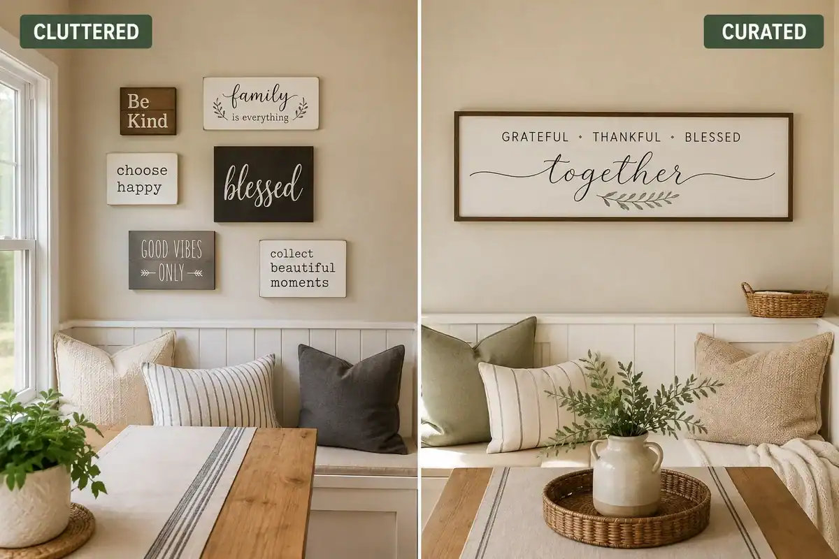
What to avoid:
- Too many word pieces. Cap it at one or two per kitchen, and let one dominate.
- Undersized signs. Aim for 60-75% of the width of the shelf, bench, or wall section below.
- Font soup. Three different lettering styles on one wall looks accidental.
- Hanging too high. Signs float when they’re not visually tied to furniture or shelving.
- Competing messages. “Eat,” “Gather,” and “Bless This Mess” on the same wall cancel each other out.
- Ignoring the palette. A honey-oak sign in a cool gray kitchen fights the room. Match undertones.
- Grease zones. Don’t hang porous wood directly behind a cooktop.
For a broader audit of what quietly cheapens a kitchen, see our roundup of kitchen decor mistakes that ruin a high-end look.
Kitchen Signs Decor Alternatives to Wall Art
If word signs feel like too much, several alternatives fill a blank kitchen wall with the same warmth and less text. These also pair well beside a single sign, giving you layers instead of repetition.
- Vintage plates or platters hung in a loose cluster.
- A wall-mounted shelf styled with stoneware, a cutting board, and one small plant.
- Botanical or fruit prints in matching frames, which read classic rather than trendy.
- Antique kitchen tools, a copper mold, scale, or set of wooden spoons.
- A framed mirror to bounce light in a small kitchen.
- A pegboard or brass rail with hanging mugs and utensils, decorative and functional.
- A calendar board or chalkboard that earns its wall space daily.
Ideas that mix signs with plates, shelves, and greenery show up throughout our cozy dining nook decor ideas, and the current appetite for texture-forward, comfort-driven pieces is echoed across top-selling Etsy home decor trends. If your counters need editing before your walls do, start with what to put on kitchen counters.
FAQ
What should a kitchen sign say?
Short, functional wording tied to the zone: Pantry, Coffee, Bakery, Market, Fresh Bread, or your family name. One to three words looks most intentional.
How big should a kitchen sign be?
Roughly 60-75% of the width of the shelf, bench, or wall section it sits above. For a 48-inch bench, that’s about a 30-36 inch sign.
How high should I hang a kitchen sign?
Center it at eye level, about 57-60 inches from the floor on an open wall, or 6-8 inches above a shelf, counter, or bench so it reads as connected.
Are funny kitchen signs a good idea?
Yes, in small doses. Limit humor to one small piece in a low-traffic spot, like inside a pantry or beside a coffee maker, and keep the rest of the wall calm.
Can I put a wood sign near the stove?
Only if it’s sealed, and ideally not directly behind the cooktop. Heat, steam, and grease damage raw wood and paper-backed prints.
How many kitchen signs are too many?
More than two word-based pieces in one kitchen usually tips into clutter. Swap extras for plates, prints, shelving, or greenery instead.
Do kitchen signs work in modern kitchens?
Yes. Choose a single typographic print in a slim frame, or unframed metal lettering, in black, white, or a muted neutral that matches your palette.
What’s the cheapest way to get a kitchen sign?
DIY from a thrifted board or cutting board, usually $10,$25 in materials, or shop small metal signs at budget retailers in the $15, $25 range.
Conclusion
The kitchens that pull off kitchen signs decor beautifully almost always do less than you’d expect: one well-scaled sign, wording that actually means something, a material that echoes something already in the room, and a plant or basket nearby to soften it. That’s the whole formula.
Your next three steps:
- Measure first. Tape out your sign’s footprint on the wall and live with it for a day.
- Edit second. Take down any existing small word signs and see how the wall feels with one piece instead of four.
- Buy or build third. Choose wood for warmth, metal for contrast, or a custom sign if you want a truly personalized space.
Where style meets comfort, restraint is the secret ingredient. For more room-by-room styling tips, browse our full kitchen and dining decor guide.